wave tucks

wave tucks
Showing posts with label window treatments. Show all posts

Tuesday, August 16, 2011

Bedding and Window Treatment Project


Yesterday we installed a large window treatment project for a long-time client.  Here is the evolution of the project:

My client called saying that she was ready to update her master bedroom's bedding and add window treatments.  You can see from the photo below that the window area is a large expanse which included a 13 foot long main wall and about 4 feet on each side wall.  The right side wall includes a functioning door which would need to remain in use.

 At the time of our original appointment, the walls were a light peach tone.  After all of the fabrics and trims were selected, my client had some remodeling work done and also had the bedroom freshly painted in a neutral taupe tone.

Because the door needed to remain functional, we elected to use the Operable Door Valance system, which I have featured in this blog previously.  We installed the bedding last month and did a "dry fit" of the ODV to make sure the dimensions worked well since we would be adding many linear feet of connecting valances and the measurements and sizing needed to work perfectly.

The photo below shows the bedding, which was planned to coordinate with the existing oriental rug in the room.  We choose rich inky blue matelasse for the coverlet, featuring a self cord and scallopped hem.  Tone on tone Euro pillows add height at the back of the bed and rectangular pillows in an embroidered fabric with contrast twist cord are placed at the front. 

 The foot of the bed features a scaldino, which is a long rectangular fabric piece, filled with layers of heavy interlining for weight and softness, and backed in the same fabric.  The scaldino is trimmed in gold silk cording and features a beautiful Robert Allen red and gold silk tassel trim on the ends, which overhang the sides of the bed and end above the edge of the coverlet so that the trim shows nicely on the ink blue fabric.

The scaldino is made using a gorgeous Schumacher fabric.  This fabric was very expensive but worked perfectly in the project and served to "marry" all of the fabrics together.  We very carefully planned how we would use the fabric, in which direction and which motifs would be centered.  This allowed us to use the same fabric and motif on the back, and you can see the matching patterns on the edge of the scaldino.  We had just enough fabric left over to use a remnant for the centerpiece of a feature pillow which you will see below.

The gathered silk bedskirt is a red Kravet fabric with gold embroidered accent details and is lined and interlined for fullness and softness.


This above photo also shows the ends of the scaldino and the tassel trim accents.  This photo also shows the addition of a gorgeous neckroll pillow that we added at yesterday's installation.  We utilized the medallion motif from the scaldino fabric for the neckroll's centerpiece, added blue silk cording on the centerpiece's sides and rouched gold silk fabric on each end.  Blue silk cording was added on the ends, and self lined gathered gold silk forms the end pieces which are tied with gold and navy tassel ties. 

Doesn't this one pillow add so much to the bed?  It is a wonderful unifier and adds softness and more detail to the project.  I love this pillow!


 Above you can see a closeup of the pillows on the bed - a lovely combination!

For the window treatments, we wanted to break up the long linear wall to provide some movement and shape, so we lifted the center swagged sections.  Here is a rendering of the proposed project, which is shown to scale and in the fabrics and colors chosen for the room:


And here is the completed project:


Backdrop cornices in a solid dark blue fabric add contrast and interest to the overlay valances.  The valances are self lined in the gold silk fabric and interlined for weight and softness.  The gold silk can be seen in the cuffs, inside of the horns and on the cascades on the ends of the treatment.  The main fabric is the embroidered gold/dark red fabric.  We used the solid blue fabric for microcording at the edge of the cuffs and above the tassel trim. 

Many times the tassel trim has a pretty edge on the top and is applied on top of the fabric.  In this case, we felt using that method would add too much gold to the treatment, so I applied the blue microcording to the top of the tassel trim's top edge, thereby covering some of the gold and showing only the fan shape of the edge and the tassels.  The trim was inserted into the seam...and it looks beautiful!  I love the weight that tassel trim adds to the hem of treatments like this.


The photo below shows a perspective of the room with the window treatments and the bedding.  We will be adding a decorative fabric throw and some pillows to the chaise lounge in the next couple of weeks.  As you might notice the chaise and plant are out of place in this photo; there were painters and other contractors at the home yesterday while we were working, so those items had been moved to accomodate their projects.


Hope you enjoy this finished project as much as I did!

Susan

Monday, May 16, 2011

Lone Star State of Mind

How do four months go by without a blog post?  Quickly!  I apologize for my absence...I have been busy with client projects and teaching (last month in Las Vegas) and coordinating some upcoming seminars in July and September.  But I am back to the blog!

We recently installed a wonderful cornice and traversing drapery panel project for a client who is both a friend and neighbor.  Her newly constructed home has a Texas/lodge theme throughout and it has been fun working together to design and create window treatments for her.  She has a wonderful eye for design and collectibles and she knows her preferences very well.  She is quick to select designs and fabrics and is extremely creative in her selections and ideas.

The project below is the rendering I created for the study in their home.  With a large window facing the front yard, she requested traversing drapery panels for privacy and light control topped with a shaped cornice with nailhead accents at the bottom cornice edge and in a star shape at the center.


Not shown in the rendering are the nailheads that would embellish the hem shape.  The drawing shows the numerous measurements that I needed in order to make sure the proportions worked well in the room.  The cornice is 106" wide, and 28" at the longest point (the outer edges) and 15" at the highest (short) point. 

When a cornice has this many curves and varying long and short points, it is important to make a paper template and carefully plan the spacing for each nailhead, so that the nailheads can follow the curves, bends and corners and match evenly on each side of the cornice.  These nails were almost 1" in diameter, and I wanted to have some open space between them so that they did not overtake the cornice.


I wanted to use slightly closer spacing on the nailheads for the star shape, so that it did not become too spread out.  It took some planning to make sure there would be a pointed edge at the tip of each star point, yet to not have the nails closest to the points overlap or abut each other too closely.

In order to visualize the spacing using the actual nailheads, I drew out the cornice edge, marked the spacing and inserted the nailheads into a piece of Firmaflex.  In this way, I could see the nailheads upright and inserted and check the spacing for any needed adjustments.  When I liked the layout, I began to insert the nails into the cornice.


Here is a photo of the faux suede cornice and drapery panels installed.  You can see the Texas theme carried out elsewhere in the study, can't you? Yes, those are horns on the chair on the right side of the photo.  Don't you love the open frame with a decorative plate hung in the center (to the left of the stacked suitcases)? 


Additionally, the exterior of the home is a putty/tan color, so we used a putty lining on the draperies and cornice.  Using a tan lining coordinates well with the exterior of the home and blends more evenly.  A stark white lining would have a more severe finished look and could look a little jarring across the exterior of the home.  This tan lining looks great, and matches the lining we have used on the guest bedroom upstairs.  I will post a photo of the exterior and some closeup photos soon.

The next project for this home is the dining room, which will include another cornice accented with antique iron gate hardware and cafe curtains.  The homeowner has also given me a vintage mail carrier's bag that we will work into two valances for another room.  Like I said, she has innovative and creative ideas and is very fun to work on projects with!

Thanks for reading!
Susan

Thursday, January 13, 2011

Kids' Rooms + Embroidery = Fun!

I am lucky enough to count many of my clients as my "favorite clients".  My very first client is one of these...we have continued to work together on projects throughout her home since 1995.

We haveredone her childrens' rooms several times, moving from almost-nursery style, to juvenile looks, to youthful styles, to teen rooms.  It is fun to watch the progression of the kids' rooms and the styles, colors and themes that they like and how they change.

This valance was designed and fabricated by a friend of the family.  The homeowner wanted to add some stronger color and style to the treatment and to coordinate with a new quilted Pottery Barn coverlet in a pretty kiwi green color.

The photo is the "before" shot of the pair of windows.


By adding an overlay with custom embroidery and coordinating cording, the bedspread is tied in and the valance (stationary roman shade) has some added weight and detail.


These purchased pillows and shams are nice, but the client wanted to add some personalization and color to coordinate with the valance overlay.

The photo below are the original purchased pillow shams and comforter.


We designed slightly larger Euro sham pillows in a soft shell-pink with  kiwi green embroidery.
The smaller pillows have a 1/2" contrasting flat welt around the edges which is gathered a bit at the corners. The smaller pillows can be used on the bed or the upholstered side chair.  One of the smaller pillows features some floral embroidery also. 

I think it is very fresh and crisp!


The photos below show a young boy's room - he loves basketball, and more specifically, the Houston Rockets.  We used a purchased plaid comforter as our base, and incorporated the Houston Rockets theme.  We ordered these wonderful and large Rockets pennants, and mounted them on a black backdrop, blackout lined to prevent light bleed-through and fading.


Centering the valance is a custom embroidered pennant with the boy's name positioned vertically and a "swooshing" basketball flying through the net.  Contrasting banding and cording mimics the Rockets banners for unity and balance.


Below is the completed room which features some of his sports memorabilia on display.  He was happy with his room, as was his mom.  It was a fun project that I enjoyed working on.  Kids rooms are always great to plan and coordinate, and I love working with themes and incorporating custom embroidery too.


Enjoy!

Susan

Tuesday, December 28, 2010

Before and After - A Great Bedroom for a Young Girl

I wanted to share with you one of my favorite projects.  This wonderful client's daughter had very clear ideas and opinions of what she wanted for her room's decor.

She had lovely handpainted furniture throughout her bedroom that they did not want to replace, but wanted to update the look for her changing preferences.  We decided to keep slipcover some of the furniture to coordinate with the new look, beginning with the vanity skirt and vanity chair.

The photo below shows the soft pink paint and fabrics on the vanity and chair (before).  The doors below the vanity top open and are functional for storage.


The fabrics the clients selected were a fun chocolate brown, teal, green and white paisley, along with several coordinating solids and smaller scale patterns and textures.

Below is the rendering I presented for the bedding project.


This was such a fun project!  I loved having this young girl select her fabrics and trims and her enthusiasm was infectious!

The photo below shows the vanity skirt in a gathered iridescent polyester topped with a scalloped overlay with chocolate brown covered buttons and a tassel tie in the center.


Below is the "before" photo of the adorable sweetheart vanity chair.  I loved the shape of it and the full skirt.  We only needed to update the colors and fabrics to coordinate with the new look of the room.


The slipcover below has a velcro closure at the back laced-up placket.  The quilted chocolate brown fabric on the upper portion of the chair coordinates well with the gathered crushed pleated skirting.  The heart shape of the upper chair is accented with teal cording.  A green sash circles the "waist" and features a ribbon bow above the scalloped green overlay on the skirt.

Teal cording also accentuates the vertical lines of the back centerpiece, and a bright green double faced satin ribbon laces up the back with a bow at the very top.

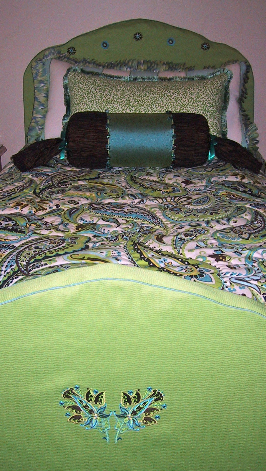
The headboard and footboard had been beautifully decoratively painted, but in keeping with the new look for the room, we slipcovered both pieces in a textured solid lime green fabric accented with teal cording.  We selected fabric pattern components and had them custom embroidered in specific sizes and thread colors to tie in with the other fabrics in thsi project.  The smaller emblems are embroidered on the top of the headboard slipcover, following the shape of the headboard.  

The crinkle gathered dust ruffle is perfect in this room!  The paisley fabric used on the comforter was quilted on the fabric pattern design, to accent the paisley and swirl designs.

Pillows were made to coordinate, using striped, swirled and solid fabrics and adding ribbon ties and embroidery on the neckroll, along with a fun Kravet square beaded trim.

A mirror image embroidery design was created for the centerpiece of the footboard slipcover (below).


The photo below shows the completed bedding project - so fresh and cute!


The photo below shows one of the window areas in the room.  Stationary silk panels are topped with a shaped hem and draping valance, accented with lime green microcord above and below the brown band and a wonderful teal and lime green tassel trim.


This was one of my favorite projects and the clients were terrific too!

Hope you enjoyed the "tour" of this project!

Susan