wave tucks

wave tucks

Tuesday, December 28, 2010

Before and After - A Great Bedroom for a Young Girl

I wanted to share with you one of my favorite projects.  This wonderful client's daughter had very clear ideas and opinions of what she wanted for her room's decor.

She had lovely handpainted furniture throughout her bedroom that they did not want to replace, but wanted to update the look for her changing preferences.  We decided to keep slipcover some of the furniture to coordinate with the new look, beginning with the vanity skirt and vanity chair.

The photo below shows the soft pink paint and fabrics on the vanity and chair (before).  The doors below the vanity top open and are functional for storage.


The fabrics the clients selected were a fun chocolate brown, teal, green and white paisley, along with several coordinating solids and smaller scale patterns and textures.

Below is the rendering I presented for the bedding project.


This was such a fun project!  I loved having this young girl select her fabrics and trims and her enthusiasm was infectious!

The photo below shows the vanity skirt in a gathered iridescent polyester topped with a scalloped overlay with chocolate brown covered buttons and a tassel tie in the center.


Below is the "before" photo of the adorable sweetheart vanity chair.  I loved the shape of it and the full skirt.  We only needed to update the colors and fabrics to coordinate with the new look of the room.


The slipcover below has a velcro closure at the back laced-up placket.  The quilted chocolate brown fabric on the upper portion of the chair coordinates well with the gathered crushed pleated skirting.  The heart shape of the upper chair is accented with teal cording.  A green sash circles the "waist" and features a ribbon bow above the scalloped green overlay on the skirt.

Teal cording also accentuates the vertical lines of the back centerpiece, and a bright green double faced satin ribbon laces up the back with a bow at the very top.

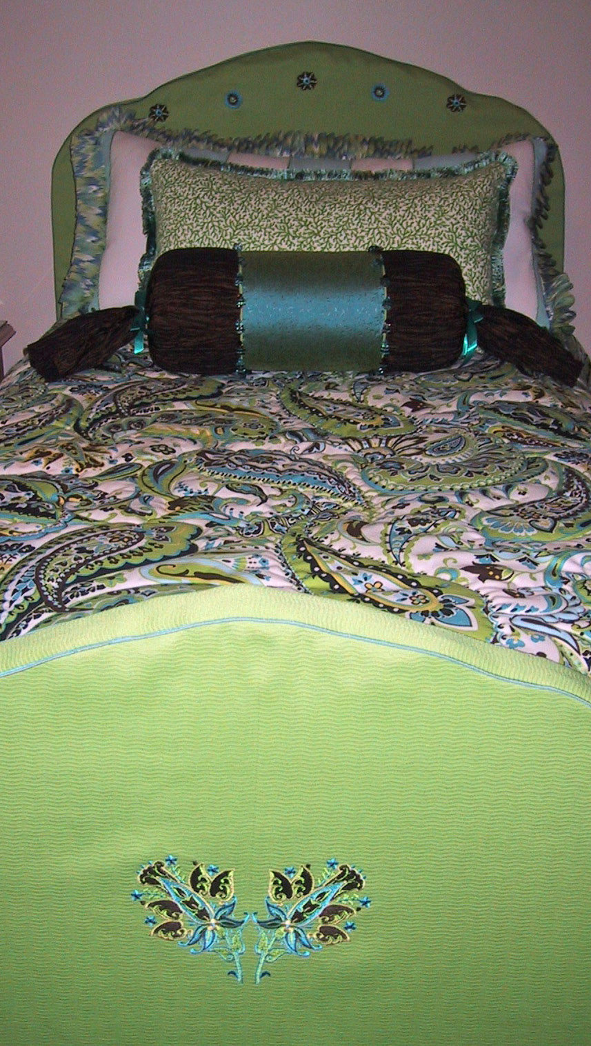
The headboard and footboard had been beautifully decoratively painted, but in keeping with the new look for the room, we slipcovered both pieces in a textured solid lime green fabric accented with teal cording.  We selected fabric pattern components and had them custom embroidered in specific sizes and thread colors to tie in with the other fabrics in thsi project.  The smaller emblems are embroidered on the top of the headboard slipcover, following the shape of the headboard.  

The crinkle gathered dust ruffle is perfect in this room!  The paisley fabric used on the comforter was quilted on the fabric pattern design, to accent the paisley and swirl designs.

Pillows were made to coordinate, using striped, swirled and solid fabrics and adding ribbon ties and embroidery on the neckroll, along with a fun Kravet square beaded trim.

A mirror image embroidery design was created for the centerpiece of the footboard slipcover (below).


The photo below shows the completed bedding project - so fresh and cute!


The photo below shows one of the window areas in the room.  Stationary silk panels are topped with a shaped hem and draping valance, accented with lime green microcord above and below the brown band and a wonderful teal and lime green tassel trim.


This was one of my favorite projects and the clients were terrific too!

Hope you enjoyed the "tour" of this project!

Susan

Friday, December 10, 2010

And the (Gorgeous) (Velvet) (Embellished) Stockings were hung by the chimney with care....

Earlier this year a neighbor client of mine asked me to be thinking about some ideas for Christmas stockings for their family.  Their home has some Renaissance accents (and even a knight in shining armor!) and I knew they would want to continue that theme with their stockings.

They actually own Sherwood Forest faire, a Renaissance style festival outside of Austin, Texas.  You can learn more about their event at http://www.sherwoodforestfaire.com/


Below are a few pillows I made for them last year, including an ultrasuede fleur de lis and an embroidered castle motif.


Keeping in mind the Renaissance accents and the existing gold, deep burgundy and bright blue accents, I designed coordinating stockings that would work well with their existing furnishings.

I made a trip to High Fashion Fabrics, a fabric store here in Houston.  They have a four story building full of designer interior fabrics, and another adjacent one story building for apparel fabrics.  In the apparel building, I found the perfect combination of fabrics, ribbons, trim and China silk for lining the stockings.

First, I stabilized the bright blue and burgundy silk fabrics to add a little body.


We wanted to differentiate the male stockings from the female stockings.  Opting not to incorporate embroidered names, we decided to use blue pleated cuffs for the male stockings and burgundy rouched cuffs for the girls.  The toe areas and microcorded seams would contrast with the cuffs.

Additionally, we wanted the adult stockings to be about 25% larger than the children's stockings.

I used my handy-dandy Clotilde pleater to get perfect pleats for the cuffs.  The stabilized fabric added a little bit of fullness to the pleats also, allowing them to have a bit of heft to them, which I loved!.

In the photo below, I have two cuff sections pleated onto one pleating template.


In addition to differentiating the stockings by gender, we wanted to identify each person's stocking in another way.  All of the stockings had a grouping of sheer blue ribbon loops, double faced satin ribbon loops in burgundy and also gold, and bright blue rattail cord as a fun accent. 

I sewed blown glass accents to the ribbon of each stocking:  the first born girl had one glass accent on several ribbons; the second born girl had two glass accents on several ribbons. 


Each stocking had several jingle bells attached to the rattail cord and one bell at the pointed and curled-up toe.

The foot and toe sections of each stocking are stuffed with batting for fullness and to ensure a nice shape.  The matching China silk lining fills the body of the stocking down to the heel area, so that the batting is not disturbed and cannot shift out of the designated area.

I love the sheen of the crushed gold velvet, don't you?

Below is a photo of the beautifully decorated mantle, underneath a tapestry wall hanging that I had applied banding and backing to and had installed above the fireplace.


I hope you have enjoyed this project as much as I have!

Happy Holidays -
Susan


Thursday, December 9, 2010

Holiday Home Tour in Houston

For the first time ever, the elegant Southampton area of Houston is having 6 homes on tour.  This Sunday only, these homes will be decorated for the holidays and open to visitors.


Tickets are $25 for the six homes, and tickets can be purchased at any of the tour homes:

1754 Rice Boulevard
1907 Albans Road
2103 Albans Road
1902 Sunset Boulevard
2115 Sunset Boulevard
2231 Wroxton Road

In the next day or two, I will post photos of the gorgeous holiday stockings I made for a growing family...I will deliver them tomorrow and take photos of them and post them soon!

Susan


Sunday, November 7, 2010

Aisles and Aisles of Inspiration

I attended the Internatioanl Quilt Festival here in Houston last week.  There were about 1,000 vendors showcasing and selling quilting tools, fabrics, machines, books, thread, patterns, storage supplies and a whole lot more.  There were 19 aisles chockful of everything imaginable to help quilters creative beautiful art.

Additionally, a main feature of the Quilt Festival are the hundreds of gorgeous quilts on display.  I try to attend the festival each year, but am generally on limited time and spend most of my time on the show floor looking for products that might work well in my drapery workroom.  I usually don't have much, if any, time to peruse the quilt displays. Boy, have I been missing out!!

Below is a photo of the Handi-Quilter $10,000 award winning quilt.  It was so gorgeous!  This was the creator's third Best in Show award at the Festival in less than 10 years. 


The docent showing the quilt said that the creator spend 1,500 hours quilting the piece - not putting it together, but doing the quilting along!  Oh my gosh!  Here is a close up of the detail work - it is stunning!

There were so many innovative, creative and gorgeous quilts on display.  My heart was full and I was smiling as I walked through the exhibit hall with hundreds of other attendees and admired all of the hard work, dedication, patience and skill on display.


One of my favorite quilts was this smaller display quilt showcasing kimonos and decorative knots.


This quilt was about 4 feet x 4 feet, I think.  Each smaller kimono was about 8" square.  Aren't they wonderful?  Each kimono was made in a different fabric and the cording for the knots contrasted with the kimono fabric.  They were adorable!  And the contrast with the background fabrics was lovely.

The blue kimono below was the centerpiece of the quilt.


Below is one of the smaller kimono pieces.


The quilt below took my breath away.  The solid blue base was intricately stitched in curved, flowing patterns and accented with contrast fabric and beaded details. 
--

 Look at this gorgeous detail work! 


This quilt was stunning too - I loved the organic pattern.  The pebbles were so beautiful; see the photos below for a closeup of the intricate work in metallic thread.


This classically styled quilt was a study in contrasting colors and shapes.  Lovely!


The photo below does not do this quilt justice, but the closeup photos give you an idea of the perfection in stitching!


 I loved the detail work and the addition of the crystal accents.

This creative style was gorgeous too, and I loved the use of the metallic threads to make it sparkle.

Look at this stitching!


There was even a category for quilted clothing - beautiful!


This jacket and cummerbund caught my eye.  Look at the detail work, knots, beading and stitching!


I will show you more in "Part Two" of this blog post.  My mind is still reeling with ideas of techniques and designs to incorporate into window treatments.  The Quilt Festival show floor was a cornucopia of inspiration an ideas.  I look forward to sharing more with you in the next post!

Susan

Sunday, October 3, 2010

Gorgeous Silk Toile with Scalloped Insets

I love box pleated valances; they are a classic look and are perfect treatments to add contrast banding, buttons, shaped hems, etc.

Using contrast fabric in the inset pleats is a great way to add color and flair to the treatment.  However, most times the contrast inset pleat in the valance does not allow for very much of the contrasting fabric to show.  So I designed a scalloped inset pleat valance...and that became a jumping off point for a scalloped leading edge drapery panel.

The panel below was created using a gorgeous Catania Silk fabric (http://www.cataniasilk.com/) - their Toile Silk pattern in a lovely red and black pattern.  Isn't it striking?

I used Catania's solid red silk for the scalloped openings and used black silk microcord for the edging around the openings and the vertical lines between the scallops. 

The tailored inverted pleat heading allows the leading edge design and accents to stand out as a focal point.


  I used Chinese frogs and knots at the top and bottom points of the scalloped openings.  To add texture and interest to the scalloped opening, I added a solid black tassel to fill the open space and add contrast.

There are instructions online for creating Chinese frogs and knots.  However, these were purchased from High Fashion Home Fabrics in Houston.  They carry several basic colors of knots and frogs.  If you wanted a specialty color to coordinate with your treatments, they would need to be custom made.


The two photos below show the original scalloped valance I made.  Using a floral fabric that would be perfect in a young girl's room, I added ribbon bows at the top and bottom of the openings.  Ribbon loop trim was also added at the bottom of the valance. 

The scallops are 6" tall, which allows for this treatment to be a functional roman shade...the segments would draw up from one scallop to the next, so that full scallops are shown at all times above the folds.


 The photos above show how different inset fabrics really can transform the look of the treatment.  The solid pink fabric on the left really accentuates the contrast and shows up very well.  The photo on the right has a contrasting white, lavender and green checked fabric that shows well, but not as dramatically.  A contrast pink microcord would have outlined the scalloped segment beautifully.

As an alternative to buttons or bows, the tops and bottoms of scallops can also be accented with toggles or clasps, both readily available at craft and fabric stores.


Inset Accents:

There are plenty of alternatives to tassels or contrast fabrics inserted into the open scallop areas.

Below shows a set of decorative frogs with center knots as a lovely accent.


To accent treatments seasonally, you could custom embroider small segments to alternative for special events or holidays.  The insets can be reversible and attached to the inset openings by small velcro tabs.  When the holidays approach, just flip over the inset!

Leaves for fall....
 

Holiday ornaments...
 

Holly leaves and berries...

The embroidery could alternative between segments....the first, third and fifth open scallop could be green leaves, and the second, fourth and sixth opening could be rust leaves....or alternating ornaments or other holiday accents could be showcased. 

For fun, what about "HO HO HO"?

Anyone who knows me knows that I love Christmas, and I LOVE the idea of using seasonal embroidery for the holidays!

Speaking of seasons, Houston has finally received a little taste of fall with some cooler temperatures.  It feels so fantastic!  I am also looking foward to heading to Boston soon to present a couple of seminars to a wonderful trade group...I am really looking forward to experiencing their temperatures too!

Happy Fall!

Susan

Wednesday, September 1, 2010

A Tale of Two Projects: a/k/a Why I Haven't Posted Lately

I have been working feverishly on several large projects over the last several weeks - so please forgive me for starting a blog and then not posting for a long time!  My nose has been to the grindstone...and your reward for your patience is this new blog post with photos and details of each project.

You never know where your clients will come from:  I needed my computer repaired and called someone who I had read rave reviews about in the Houston Chronicle.  When we spoke on the phone he said "I am glad that you called...I just moved into a high rise condo and I need window treatments!"*

We met (after my computer had been quickly and successfully repaired with prompt and professional in-house service) and began selecting window treatments styles and fabrics.  We narrowed down the window treatment style and fabrics at the first meeting and I went back to my studio to create a computer rendering for his review.
 

This rendering shows the same basic style (a modified Jackie Von Tobel treatment from her wonderful Design Directory of Window Treatments book) on each window, but I was trying out different crown molding sizes for the top and bottom of the cornices.  The diagonal brown lines represent silk fabric cording in the same color as the wood stain for the crown molding accents.

I actually made a sample to-scale (one section) cornice to test out the proportions and see the crown molding in place so I could verify the wood trim would not make the treatment too top- or bottom-heavy in appearance.  The finished project was modeled after the rendering on the right, with the smaller molding on the bottom.  I thought the larger bottom molding shown in the left rendering made the treatment look a little too boxy and structured.

For this project, there are two windows with existing motorized shades.  The windows are about 5 feet apart; one is in the dining area and one is in the den area. 

There were several concerns in planning this project:  the right window in the den area was only 3" from the corner, so I had to allow for the drapery panel return and bracket and the cornice frame as well as the projecting crown molding trim on the cornice. 

We were concerned that the walls would be concrete, which we were prepared for at the installation.  However, the installation gods were looking down upon us and the Sheetrock walls allowed for a quick and easy installation job.

Below is the completed view of one of the windows.


The sheers add softness over the motorized shades and the drapery panels are made with a gorgeous Barbara Barry starburst fabric that has an almost quilted loft.  The stationary panels were lined in the French blackout method (face fabric, interlining, black lining and then white lining) for a luxurious hand and weight.  Each panel is 1.5 widths of material with all side and bottom hems hand sewn.

The cornices feature 1" bottom crown trim and 3" top crown, stained.  The diagonal and vertical brown trim is interlined silk fabric.  The diamonds are covered in an ocean blue dupioni silk to coordinate with the walls and the beautiful new (not shown) Barbara Barry dining room chairs.

The art work (shown on right) works wonderfully with the window treatment fabrics, picking up all of the shades of the fabrics and throughout the rooms.

Now...on to the next project!

These two rooms were for a client that I have fabricated some of my favorite projects for. 

The first room  features a large wall of windows with about 30" of space below the round window, which is above the bank of 3 windows.  For privacy and light control, we added traversing lined drapery panels in a turquoise fabric with a diamond trellis tone-on-tone design.


The valance is made from a wonderful and colorful paisley fabric from Pindler & Pindler.  The valance is raised in an arched style to take advantage of the high ceilings and to minimize the large space between windows.  There is an approximate 10" increase in height from the outer swagged sections to the center highest point of the valance.

My favorite part is the trim!  The client chose a festive and heavy turquoise, yellow and green ball fringe with a bead accent and woven band.  It adds color, contrast and weight to the valance and is the perfect finishing touch!


Additionally, we fabricated a custom comforter with the paisley pattern quilted-on-design to add loft and interest to the bedspread.  Not shown are additional pillows, including embroidery on a lime-green snakeskin patterned fabric, which looked terrific.

Now, on to the playroom!


A bright multi-colored striped fabric was selected for the pointed pennant shaped valances.  I utilized the pelmet method to add stability and shape for these valances.  The large valance was 13.5 feet long!  The small valance was about 40".  Both had long points of 24" and short points (the high points of the valance hem) of 18".  A self cording was made for the bottom of the valances in the same fabric, but cut on the bias (diagonal) to add interest. 


So, as you can see, I have been busy working on some very creative, challenging and fun projects.  I hope you enjoyed seeing them! 

Susan

*If you need the name of a wonderful computer repair company in the Houston area, email me directly and I will provide his contact information - he's terrific!