wave tucks

wave tucks

Sunday, December 7, 2014

Lots of recent projects!

This has been a very busy fourth quarter for SK Designs!  Here are a few photos of some of our recent work:

The photo below is one of my recent favorites because the room is so beautiful and so is the chandelier.  This lovely tone-on-tone ginkgo leaf patterned fabric works very well in this room. With only 4" of space between the moldings at the top of the room, we had to have custom brackets made to allow for the sheers (not shown) to slip behind the stationary panels.  The limited space required a small footprint for the bracket base.


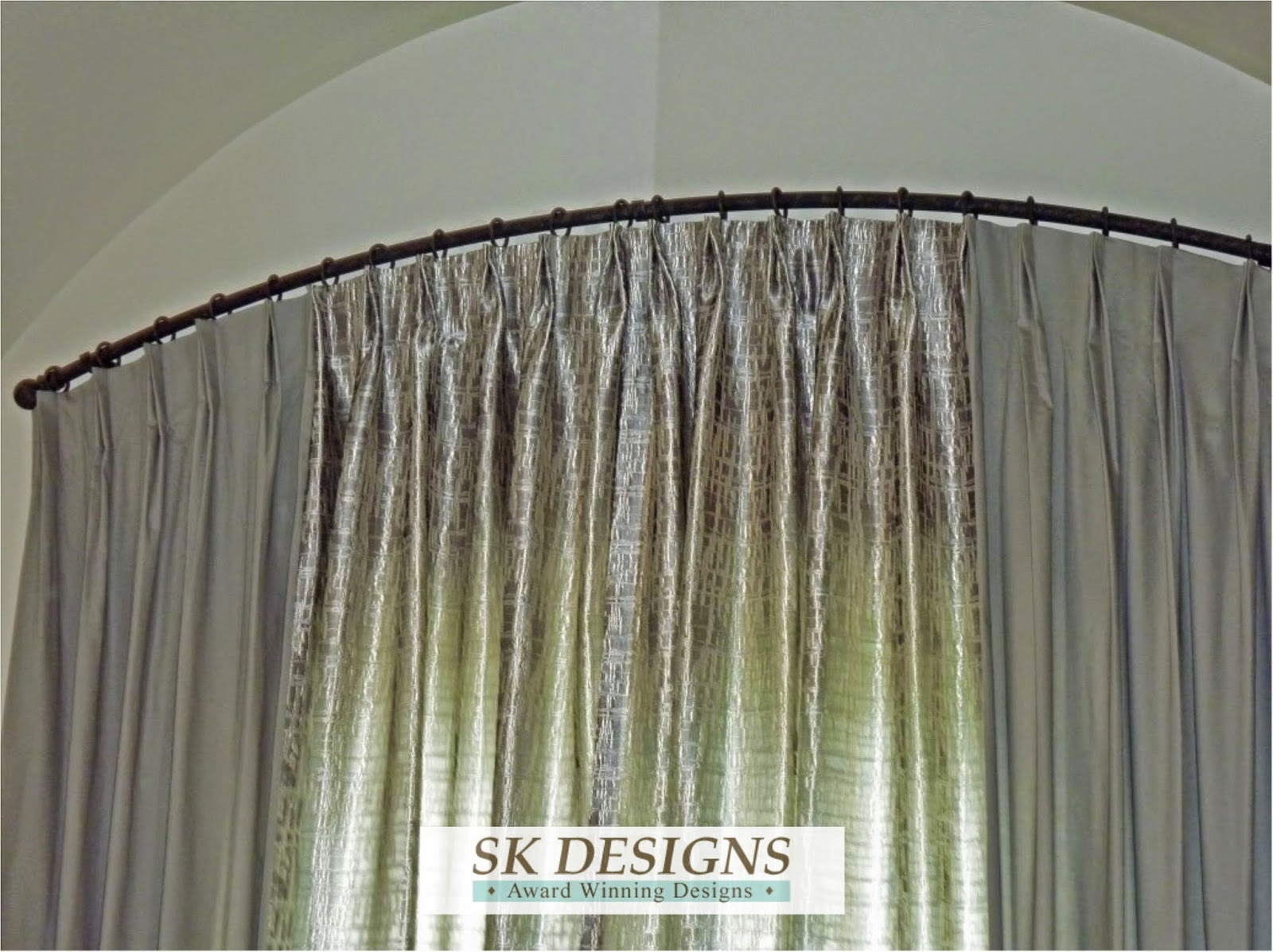
The below two photos are from the same project.  The high ceilings in the breakfast room were accented by the upper placement of the rod on the arched window, allowing for maximum light to come into the room.  The two adjacent walls featured the same embroidered sheer fabric on a continuing angled rod with an elbow at the corner.


The treatment below was fun to work on!  The client was a referral from a wonderful colleague in Colorado (the client is wonderful too).  This breakfast room already had the decorative ceiling and trim embellishments with a fleur de lis pattern.

Here is the rendering I presented to the client for her approval.  One side shows the silk swag and embroidered panel, and the other side shows the opposite fabric combination.


The curved wall with expansive glass showcasing a lovely view was accented with outer panels of embroidered fabric and a gold toned sheer for the under layer.  The draperies were topped with open swags and cascades; the outer corners were topped with shaped mini cornices with decorative hardware and the inner corners had a coordinating medallion accent, which worked very well with the light fixture finish and scrolling designs throughout the room.


Here is a closeup of one of the treatments.


We will be installing the adjacent family room treatments soon and will share them with you at that time - they are gorgeous also!

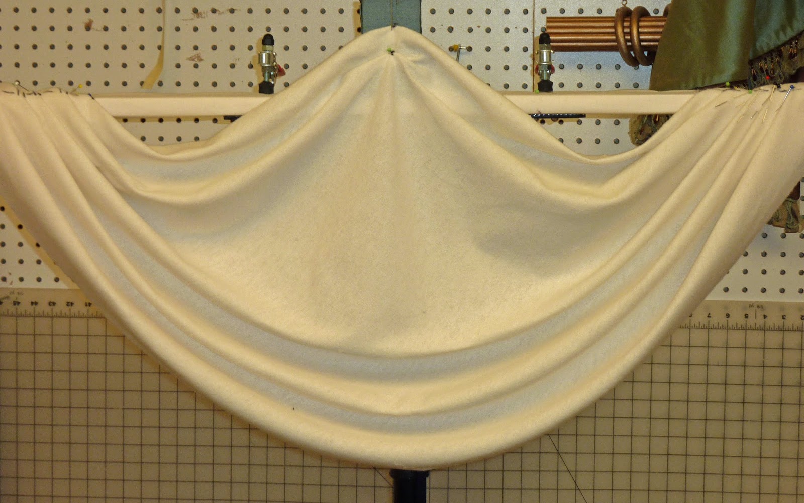
We also have done a lot of window seat cushions this year.  The cushion below has a cutout for the window sill trim.  This cushion is a "mattress" style cushion and works well in a less formal room. Don't let the "less formal" wording mislead you into thinking that this cushion can be made quickly! All of the stitching at the top and bottom of the cushion allllll the way around the cushion is done by hand and requires heavy duty thread and a firm grasp to keep the tension on the thread, which allows for the desired rippled/stitched effect.  


There will be more window treatments, bedding, blinds and shutters installed before the end of the year!  Thank you for your business and for your interest in SK Designs.

Friday, October 3, 2014

Playroom becomes a Teen Room

One of my clients contacted me after SK Designs had completed work in her kitchen, daughter's room, study and master bathroom.  She was ready to update her kids' playroom to become a "Teen Room" for the kids to study in, watch TV and hang out with friends in. Her priority was that the room be updated, comfortable and attractive to both boys and girls.

The room has two very large sets of windows.  Shown below is the smaller side window before we got started.  The walls were a pretty pale blue, accented with hand painted stars and an inside mounted lambrequin style cornice treatment, which was recessed in the inset windows and mounted close to the glass. The window in the photo below is about 106" wide. The front window is even larger.


The homeowner replaced all the windows in the house and removed the existing metal protection bars, and added new pleated shades to provide light control and privacy, as well as to reduce the glare on the TV in the room.  The new windows and shades look great inside and out!

We debated whether the new treatments should be mounted inside the window area (as they had been previously) or above and outside the window opening, on the wall.  We would be adding comfy window seat cushions for the kids to sit on while they were reading or studying.

My client had the room painted a different shade of blue and added a fun rug with chocolate brown, cream, green and blue circles accents in a variety of sizes.


We decided on outside mount cornices with a shaped hem and contrast banding and cording. We would also have plush 4" high density window seat cushions which were wrapped in Dacron for extra softness and loft. There were 3 cushions on the front window, to tie in with the breaks of the windows and also to allow for flipping the cushions in case of a spill or stain. The side window had 2 cushions. The cushions were made in a great chocolate brown and blue check fabric with a contrast brown velvet cording. They are soft and super comfortable.

Several pillows were included, in a variety of fabrics and styles, to add comfort, interest and color to the seats.

Here are the fabrics we used; it looks like a lot of fabrics! But the room is large and could easily accommodate a variety of fabrics, textures and trims. We used a mix of taupe, browns, greens, and blues. I love this combination of fabrics together.


Here is the newly installed cornice on the large window.  This cornice was 155" long - a big beast!  I opted not to hinge this cornice for transportation.  I knew I would be able to move it out of my workroom and into the client's home without having to use a hinge.  But it was bigger than my 12 foot long work table, so I did have to add side tables to my workspace so that I could work on the cornices effectively.


I really do like the effect that the outside mounted cornice has in taking advantage of the height in the room and also creating a cozy seating area for reading or studying.

Hope you enjoyed this project!

Susan

Friday, July 25, 2014

A Beautiful Bathroom

This gorgeous bathroom belongs to a new client who found SK Designs on Angie's List!  They had recently moved to a beautiful home and were making some design changes, including the window treatment for their master bathroom.  The photo below is the "before" photo.  It shows the barrel ceiling and arched window which had been treated with some light cafe curtains.


The homeowner wanted a treatment that provided some privacy but also matched the drama and scale of the existing bathroom finishes.  She had already purchased a solid grey fabric and a lovely semi-sheer silver/grey fabric and wanted a metal rod similar to those in the attached master bedroom.


As I began to fabricate the treatment, I realized that the sheer fabric looked great on each side and wanted to make sure the client selected her preferred look.  So I sent her a photo showing each side so that she could select which one she liked better.  She selected Option 2, which I liked best also, since it had more contrast and drama.


The fabrics looked great paired together.  She wanted to use the solid fabric for the outer panels and the sheer fabric for the center area.  Below shows the two fabrics and the custom rod, which I modified to add more black to coordinate better with the fabrics.


As you can see in the original photo, there was a lot of available room above the window.  I suggested we use an arched rod to match the ceiling arch and other arched openings in the room, and that we place the new rod to be in proportion to the ceiling height.  The client readily agreed and I went to work!


I had the metal rod custom bent to our preferred shape and then I drilled the holes in the top of the rod for the metal "sticky rings".  This allowed me to be very specific in matching the holes/rings to the pleats in the completed panels.  I prefer the "sticky rings" because they have a little spike at the upper inside of the ring, and allow the ring to hang straight with gravity.  It gives me, as a fabricator, more flexibility and accuracy in the workroom, instead of having rings welded into place which can appear a little angled and bulky and don't allow for any adjustments.  These sticky rings are an innovative product by Amore' Drapery Hardware.  In the photo below you can that the revised finish on the ring, to include more black instead of brown, as well as the little spike at the top of the ring which drops into the drilled holes at the top of the rod.


Here is the completed project, which really complements the scale of this beautiful room!  The patterned sheer in the center allows for some filtered light while still providing privacy.


Below is a closer photo of the panels and rod.

And here is my client's own photo of the room at night, which showcases the beautiful sheer even better.  As you can see, we extended the panels about 8" out on each side of the window width, in order to frame the tub perfectly.


The client was really happy with the finished product, which we installed just in time for a party in her new home!

Thanks for reading!

Susan

Thursday, July 24, 2014

Raised Swag with Bling - inspired by Houzz

I have been busy lately and will be adding numerous posts about my recent projects.  This post is about the guest bedroom for some new clients who were such a pleasure to work with!  The client's mom contacted me about providing window treatments for all of the couple's new home's windows and they were great to work with from the word "go".  The client provided me with numerous inspiration photos from Houzz, along with photos of their existing bedding or furniture, so that I could bring ideas and fabrics that would work well with her initial ideas.

We decided on ALL of the styles and fabrics for all eight rooms in one appointment - whew!  It was great fun to select everything all at once and get the fabric, trim and hardware orders rolling in.

This post is about the guest bedroom project.  Below is the photo of the existing bedding that we would coordinate with for the window treatment.


The inspiration photo showed a raised swag with contrast cascades and choux which were accented with large faceted faux crystals.  I love this treatment and in the inspiration photo, you can see the proportions are perfect for the window, and the fabric pattern repeat matches on the shower curtain and the cascades - design perfection by Pamela DeCuir Interior Designs, with flawless fabrication by Design by Evelyn!

Design by Pamela DeCuir Interior Designs; Fabrication by Design by Evelyn
I made a mockup of the treatment in my workroom, to check the proportions and make sure the swag fold would drape well in both the bottom folds and the lifted folds.


We selected an embroidered fabric for the main fabric, with contrast dark cream for the cascades and medium blue for the microcording on the cascade seam.

Here is the finished treatment at installation:


The husband was home during install and took photos to send to his wife as we went from room to room, so she could see how the project was going.  When she arrived home, she sent me the sweetest email stating that she ran from room to room, so excited to see each project and how well they complemented each room.  

I will be posting photos of the rest of their treatments soon - keep watching!

Susan

Thursday, May 1, 2014

*Bright & Fun Girl's Room Project

A couple of months ago I mentioned an upcoming fun project for a little girl's room that I was getting ready to work on.  The fabric and trim selected is so pretty and I was looking forward to working on the combination of trim and fabrics for this project.  We recently installed this and I wanted to share it with you.


Here is a photo of the existing bedding in the room which was our jumping-off point for fabric and trim selection.  Isn't this great? I love the vibrant colors and contrast and I knew it would be easy to find fabrics and trims to coordinate.

After the floral fabric was selected, I found two solid fabrics to coordinate:  a bright orange and a peony color.  The orange would be the lining and the cuff for the valance and the peony color was used for the contrast cording at the heading and as an accent on the pillow.

I found a sassy trim for the valance hem and the pillow accents:


I created two valance renderings for my client to select from; a shaped cornice or a raised valance with finials.  Either treatment would take advantage of the 13" available above the window, and also allow for a sufficient finished length that would cover the existing shade in the window when it was fully raised.


The client selected the soft valance, which was my favorite also!  We ordered the fabric, trim and finials and then the fun began.

The fabric had a large floral motif, which was centered on each swagged section and also on the horns, so that there is a smooth visual flow across the valance.  We also made the valance for the attached bathroom, and I centered a different motif on that valance for contrast and interest, while still providing continuity between the rooms.

Here is the completed bedroom valance:


I used Pate-Meadows finials, which are very reasonably priced and readily available.  I hand painted the cream colored finials and posts, so that they would match the colors in the treatment.

Here is a closeup of the horn and cascade, showcasing the fun trim!


This photo shows the bathroom valance with a different motif centered in the swag sections.  This valance had a finial only at the center, since the shower trim was close to the window, which worked out well for this smaller window also.


And here is a photo of the adorable pillow using all three fabrics and the trim - a perfect complement to the existing bedding!


I hope you enjoyed this project as much as I did!  The client was great to work with and the project was wonderful also.

Hope to see you soon!

Susan

Saturday, March 22, 2014

Fabric from Egypt

Recently I met with a new client who has traveled extensively throughout the world.  She had purchased some very interesting fabric in Egypt which she wanted to use for drapery panels in her family room and office.

The fabric had a 39" band of a light tan linen-type weave, followed by a 51" band of cream linen-type sheer weave, followed by a 45" band of cream linen-type sheer weave, which then repeated the three bands, yard after yard.  It was really cool fabric and I had not seen anything like it before.  The fabric was 67" wide, which is wider than the standard 54" size.


We used the fabric in two interesting ways:  first: the client wanted to align the top edge of the tan band with the window sill; second: the client liked the raw slightly raveled edge of the selvedges, and wanted to keep them (rather than cut them off and fold the edge into the side hems).

Below you can see the different colors and weights of the fabric; isn't it pretty?  You can see from the light shining through the window that the tan segment aligns with the window sill.


Below is the side hem's raw edge showing, which adds a little texture and interest and is a little bit of a surprise if you peek at the panel edges.  It also required a modification of the industry standard's method of side hems, but it was not difficult to do at all.


Both of these ideas were great examples of letting the fabric "speak" and use it in a way that showcases the qualities of the fabric.

The windows already had honeycomb shades in them, so the purpose of the fabric panels would be to soften the room and to filter the light when the shades were raised.

Since the fabric was 67" wide, and two of the family room windows were 72" wide, and the client wanted to use a single width for each panel (no seams) on those windows, I modified the spacing of the grommets.  Generally, the same size spacing is used between each grommet, but for this project, I allowed more spacing between the two grommets which would form the "front" fold, and slightly less between the two grommets which would form the "back" fold (closest to the wall).  This adjustment meant that the folds to the front did not look skimpy, while still allowing as much fabric as possible to cover the expanse of the rod.

We lined the panels in a lightweight lining and added #15 matte chrome grommets, which matched the 1 1/8" metal rod with crystal ball finials.


The client wanted to cover the full wall of this office area, instead of just the window section. This really softens the room also. The panels really finished off the room, providing a soft backdrop to the stunning art and collectibles from the client's travels.

Hope you liked this project also!

Susan


Monday, March 17, 2014

Update: Remodeled bathroom treatments installed!

In my last blog post, I posted a rendering of a project I was getting ready to work on - a newly remodeled bathroom with lovely vintage tilework.  The rendering is shown below, including the detail of the button and bows planned for the shower curtain heading.


We found a really pretty embroidered fabric that worked beautifully with the tile colors - a burgundy and also a shell pink.


My client selected a tailored style box pleated valance with a solid burgundy fabric banding along the vertical folds and at the hem, which complemented the burgundy tile edging very well.  The contrast inset pleats were a tan solid fabric, which picked up some of the tan embroidery design. A burgundy fabric covered button was added along with tan fabric ties, for a soft accent on the valance.


The shower curtain turned out so pretty!  The inverted pleats were each accented with a burgundy fabric covered button, and alternate pleats also had a tan tie to coordinate with the valance.

I love it when the completed treatment looks exactly like the rendering!  Here is a full view of the completed room:


Hope you like the finished project as much as my client and I did!  Next up - linen fabric from Egypt for a client's office...

Susan

Thursday, March 6, 2014

What's Coming Up!

I believe that people are thinking it is time for Spring decorating, because I am getting a lot of new calls for appointments, which is always fun!

Want a sneak peek at what I will be working on in the upcoming weeks?

Tomorrow I will start working on an inverted pleat shower curtain with contrast buttons and contrast ties for a recently remodeled bathroom in a lovely home that I have completed other work in.  Here is the rendering for the shower curtain and also for the valance.  I love the banding detail on the valance, which will perfectly complement the existing band of tile.  The embroidered fabric is really pretty and picks up the colors in the counter, floor and tile work.  This will be a fun project!


I love the software program that I use for project renderings.  I have recently changed the background (that is shown above) that I use for renderings.  The new one is more of a "storyboard" look and I really like it.  

Using the new format below, a young girl's room project is shown.  What do you think of the storyboard format?

This great project will have a bright and vivid treatment to match her existing orange and bright pink bedding. We will also add a matching valance, scaled to a smaller window, in the bathroom.


Isn't this fabric great?  And I found this wonderful tassel trim with a bead accent for the hem detail. It is going to be so cute!

I will definitely post photos of the completed projects; hope you enjoy the "before" renderings and look forward to seeing the finished projects.

Susan

Thursday, February 6, 2014

Silk Shade with Swoops

I love meeting clients who really know what they want in a window treatment!  The advent of Houzz and Pinterest makes thousands of window treatment ideas readily available to homeowners and makes it easy to select a style or design that they like for their upcoming project.


Project window - before
Last fall, I met with a client who knew exactly what she wanted for her lovely home office in terms of privacy, light control and style, and I was happy to help her select the fabrics and trims to bring those ideas to fruition.

My client knew she wanted a pretty, swooping hemline that looked great from outside.  She also wanted a functioning roman shade that did not "draw in" on the sides in the manner that a casual roman shade has a tendency to do, since it is less structured.

When designing custom window treatments, it is always important to consider how the treatment will look from the outside.  Factors to consider: color of lining, will functional details be seen (rings/cording for roman shades), etc.  Keeping these details in mind helps determine the items that will work best for the project at hand.


One window was 60" wide, had an arched top and two window breaks, requiring two swoops. The window in this project is 90" wide, with three breaks in the windows, requiring three swoops.  In the photo on the left, the window on the right is our completed project window.


The colors in the room were neutral, allowing us lot of freedom in colors and patterns for the fabric selection.

I created a rendering for the client's approval of the style, before we selected the fabric, when we were considering using a contrast fabric in the permanent hem folds.  Once we selected the fabrics, we decided to use the contrast fabric on the valance so that it was more prominent and visible.


My client loved an embroidered Catania silk fabric with a gorgeous light blue ground with cream, russet and shades of green and yellow.  It is a beautiful fabric!  We added a little whimsy for the valance, using a green and yellow Kravet silk in a small checked pattern.  The valance featured solid russet silk to follow the soft scalloped hem, and the shade hem was accented with a a russet drop bead tassel trim with silver bead accents.  I loved the combination of fabrics and trims!


We selected a pretty polished nickel bead chain (fourth from the top) for the continuous loop cord lift system, in compliance with the safety regulations for corded products.

In order to accomplish the swooped shape at the bottom, but prevent the "drawing in" of the sides of the shades, I cut a trapezoid shape in the silk fabric for the permanent folds at the bottom of the shade.  This provided a wider area at the hem folds, allowing the desired "swooping" and creating a pretty shape for the hem when viewed both inside and outside.

The shade was blackout lined to prevent light bleed through and protect the silk.  Careful consideration was given in selecting the lift system for the shade, due to the large size (90 x 85) and the weight of the fabrics.  I checked with the fabric vendors to obtain the weights of the silk and the blackout lining to make sure the finished shade weight would be within the weight limits allowing the shade to function properly.


Here is a closeup photo of the details and fabrics - so pretty!  


We had a bit of fabric remaining, so we added a couple of "picture frame" style pillows for the sofa - perfect!  The silk center was accented with the russet microcord, providing a counterpoint to the checked fabric background.  The russet silk was also used for a small flat flange around the edges, with three little pleats at each corner.


Hope you enjoyed this project as much as I did!

Susan